Showing posts with label Pre-Production. Show all posts

3 Dec 2009

Week 4 – Second Concept – Character Designs Pt 1:

I had decided to maintain the concept of the young girl as the player character, so as to keep the idea of a neutral character, who would have had no control or understanding of the politics of the town, which I hope will subconsciously add to the sympathy of her position and amplify the power of the anti-extremism message the piece aims to convey.

To support these ideas, I want to emphasise the “cute” factor of the character, which I feel will amplify both the feeling of her young age, and the idea of her innocence in the situation. Thus I focused my research on studying how cuteness is traditionally approached in cartoons, focusing firstly on western cartoons and their style. My intentions from this was to pick out what elements combine to create the look of a ‘cute’ character, and hopefully work these concepts into my character’s design.


A sample of the Western-based cartoon artwork i collected for referencing.

Generally, I found that the western cartoons I studied tend to use flat colours much like the propaganda work I have been studying. In many cases, heads are slightly oversized, with a specific emphasis on the eyes and mouth, which are used to express most character emotion and are sometimes oversized. Very rarely were these characters shaded (though backgrounds were in some cases); it is likely this is a choice made to speed production of the media.

To further support this area of my research, I took the opportunity to book a meeting with Mr Don Parker, head of the university’s Advertising Design course, whose career has included major work roles with artistic departments of western comic and cartoon companies (including Marvel and Cartoon Network). The latter link was especially useful, as I had noticed striking similarities between the propaganda style I was following and that of Dexter’s Laboratory; one of Cartoon Network’s main animations. Male main characters (such as Dexter, the main character) are drawn with mostly straight lines and hard corners, much like the propaganda posters I have been studying, while female characters (such as his sister Dee Dee), are mostly made up of softer, curved shapes with almost no hard edges, much like how I am intending my main character to be.


Dexter's Laboratory's main Character Dexter [left] and his sister Dee Dee. Looking at their designs, i can see many similarities with the propaganda styles i have been studying.

However, I found myself quite surprised when Don revealed that I was in fact considering western art in completely the wrong way; Dexter’s Laboratory and similar animations of that era (such as Disney) were in fact western attempts at imitating Japanese Anime, rather than true representations of western artistic practice. For the latter, he recommended focusing my studies on western comic book companies, such as Marvel and DC, and artists such as Dave McKean, Jack Kirby and Brian bollard.


Front Covers of two DC Comics. Note the emphasis on the muscles of the two main characters (especially on the chest and stomach), and the use of jet black for contrasting block shading as opposed to the subtle shading common in anime-style works.

Don explained that the difference between western art and the anime-esque art I had studied so far laid in their inspirations and referencing. Anime-esque art tends to focus on stylised representation, sacrificing realism for aesthetics (such as naturally pink or blue haired characters), or emotional effect (characters designed to be overtly cute, etc). Traditional western cartoons, on the other hand, focus greatly on realism, especially regarding the designs of characters, where renaissance anatomical study is a major reference point. Body shape is based heavily around bone structure, with muscles and bones particularly defined through shading.

While my project’s simplified aesthetic prevent me applying this kind of aesthetic to most of my characters, it may be worth considering when designing propaganda posters to place within the level; many of the posters I have researched include realistic human caricatures, and shading to emphasise the facial features vaguely similar to DC and Marvel’s work.

* * *

While I have been avoiding Japanese art style at the recommendation of my colleagues, Japan-esque cartoons are well known for the ‘cute factor’ of characters. I therefore decided to return to my previously collected Japanese reference material briefly, analysing it in the same way I studied western cartoons; not focusing on the whole aesthetic, but the specific aspects of the art that make a character a desired aesthetic (in this case, cute).


A sample of Japanese-based cartoon artwork, collected for referencing.

From my research, I found that the methods used in Japanese art to create a cute aesthetic were much the same as the style found in my early western comic research. Characters’ heads are generally oversized slightly, especially the eyes, which are particularly large. Whether characters were or were not shaded depended on the atmosphere the artist was aiming to create, though otherwise colours on characters were usually kept quite plain. Backgrounds, on the other hand, were usually quite detailed; likely because background’s normally do not move, whereas the character will move around a great deal. Therefore, having a highly detailed character would make animation difficult, and significantly increase production times.

1 Dec 2009

Week 4 – Second Concept – Tank Design:

Continuing on with the representational theme, I was reminded of Dave’s idea of the tank with propaganda covering its hull, which really interested me when he presented it. Tanks are a common symbol of war and militaristic power, so having one as a centre point of the extremist takeover would be a sound choice. The oversized tank would seem even more imposing as the player’s POV would be the girl’s eyes and thus close to the ground, thus making the vehicle tower over her.


Artist’s drawing of the T-1500 “Ratte”, a real-life (and rather ridiculous) Nazi super-heavy tank/land fortress concept. This picture captures well the sort of towering monstrosity feel I want the player to feel when seeing the tank.

In keeping with the style of the project, I wanted the tank to be a very stylised tank, not one necessarily based on real life concepts. I therefore see three possibilities for the design; making it a very curvy, ‘cartoon-ish’ vehicle, using a more blocky design, or using a vehicle from real life.


Examples of images collected for mood boarding the tank were I to go for option 1. These are some of the soviet vehicles from the RTS game “Command and Conquer: Red Alert 3. While the vehicles are interesting design-wide, I personally feel the curviness doesn’t really suit a heavy assault vehicle.

All three options would fit into the project well, though I think option two would be the better option, as it would be both an original design and suit the Dimitri Moor inspiration.

* * *

Ironically, I may make use of an existing vehicle after all; the Ratte image I collected reminded me immediately of another WWII German vehicle; the Maus, one of which was actually built. It is a very blocky design with rather flat sides, which would make it perfect for displaying propaganda posters. I may decide later to create a more original tank design, but for now, I may make use of the Maus as a placeholder thank.

 
Diagrams for the Maus Tank, and picture of the single existing prototype in Kubinka Tank Museum, Russia.

Week 4 – Second Concept – Outline:

Having had the chance to look over the information gleamed from my research, combined with commentary from my colleagues and workmates, I began to rebuild the project’s design to take into account the new choice of art direction (propaganda posters), and reconsidered game mechanics.

As I was now going with a highly simplified art style, I decided to move away from the concept of a ruined village, and, as Dave had suggested, instead approach the town settling as a more representational environment than a true-to-life settlement. The child (unharmed this time) would remain the player character, navigating through a town environment. Perhaps the whole project would be the imagination of the child? Perhaps her nightmares? Did the project even need any logical explanation? My tendency to keep to semi-realistic boundaries in designs can at times restrict my work, so I think following a more representational aesthetic such as this would be a good development experience for me.

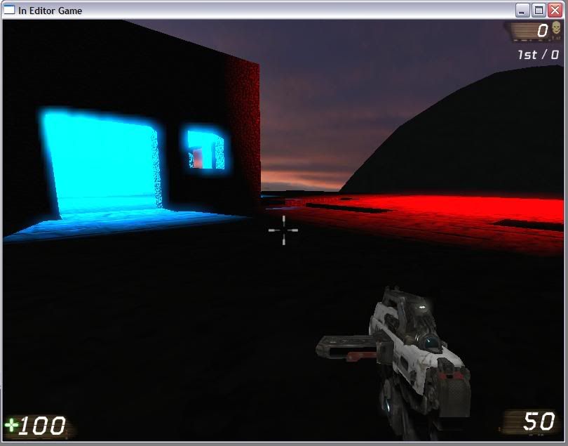
 The basic game mechanic is similar in some ways to my early Raijin concept; it will revolve around the player running through the environment as the child, avoiding the Extremist enemies that confront her. Originally the town would begin empty of them, but they would then begin to appear steadily, slowly taking over the town. To represent this taking over of the town, I would make use of brightly coloured lighting that would switch from blue (representing parts of the town not controlled by the extremists) to deep red (representing parts that are). The town would thus begin completely blue, but turn red piece by piece as the extremists arrived and began moving around. I was already sure of how I would go about doing this in Unreal, and so created a simple proof-of-concept map to showcase the effect.


Shots from the lighting showcase map. The block that represent the buildings each had a blue point light, which would turn red (like the light in the bottom left corner) if the player approached them on foot or in a vehicle.

One the advice of my colleagues during the presentation in week 2, I will be keeping away from an anime art style focus (though I may still refer to aspects of the style, as I will describe later), and instead adopt an approach more akin to Dimitri Moor’s works, with mostly flat colour and simplified details on objects, which is easily achievable by a team of one. His ideas of hard angles and straight lines would also be applied to buildings, and possibly the political extremist characters themselves. For normal citizens however (should any appear), I will be keeping to a soft-angled cartoony style, to help stand them out from the extremist characters.

In addition to my propaganda research, I decided to look deeper into cartoons and other simplified representations of worlds, to explore how such media successfully conveys its message despite using what are quite minimal assets.

 
A shot from the game “Noby-Noby” boy by Keita Takahashi, for the PS3. Takahashi-San’s game is a perfect example of the kind of aesthetics this project is considering; it uses extremely stylised assets and game play is generally quite unrealistic, but the two create a highly entertaining and colourful atmosphere for game play. One factor of this could be the concept of ‘finish’ I was introducing in the 1st Week; all the assets have been given the same treatment, thus keeping a sense of uniformity and completeness across the work.

30 Nov 2009

Week 2 – Reconsidering the Project Pt1:

Based on the comments received during my first presentation, it was evident that the project needed serious redevelopment, and was likely not even achievable for a single person to complete alone. I therefore focused my attentions for the weeks remainder (Wednesday till Saturday) on looking back on the project and deciding ways I could take it in a new direction, whilst at the same time making the project more feasible for one person to complete. At the same time I am continuing to enquire with other groups as to whether they require new members, though it appears that few if any, have such a need.

I have made the decision to follow my tutor’s advice and abandon the “Raijin” storyline that I originally planned to use. With hindsight, I realise that I have been trying to force the game concept to fit around my original storyline idea, instead of the other way round. This was a mistake, and was dragging my project away from its original concept of focusing on the political message, as Dave was explaining. Therefore, I have focused most of this week on developing an alternative concept for the game, specifically one that focuses less on a deep story, abandons the anime art style, and focuses more on the actual anti-extremism message I wish to portray with the game.

* * *

The alternative idea I decided to explore is that of a town ravaged in a recent conflict. The political extremists, in this case would have left the area prior to the game’s beginning, leaving only remnants of their presence within the ruins, and the town was now being liberated by another, non-extreme military force, whom the player was a soldier in. Whereas the Raijin concept was a highly interactive stealth game, I am considering for this concept a more observational mechanic, revolving more around the player witnessing events than on deeply interacting with the world. Items scattered around the ruined city ‘hub’ environment would trigger small segments of game play, laid out as if they were the player character’s memories or imagination deciphering earlier events (the rise of the nationalists, their taking of the town, the horrors by them) making this more of a 3D explorative environment than a fully-fledged game, which I feel would better suit the objective of broadcasting the socio-political message.


When developing this concept, I also considered using background music, feeling that music is a vital component in establishing atmosphere in an environment. Searching for a sombre piece, I was reminded of the popular song, Agnus Dei by Samuel Barber, which was notably used in the Computer game “Homeworld”. I feel the music achieves the feeling I want well, and so may make use of it in this project as my BGM.

Artistically I will keep to the concept of simple models, but instead of a stark, stylised approach as found in anime, I would look to a more realistic texture treatment, using features such as bump mapping to enhance the look of objects. My main inspirations for the environment and atmosphere in this case are war movies such as Band of Brothers or Enemy at the Gates, notably those scenes set within city environments.


Concept sketch of the layout for the level, focused around a devastated street intersection and two parked military vehicles. As with the earlier Raijin project, I wished to try and contain the level as best as possible; focusing on a smaller, carefully designed and filled space as opposed to a large open level, hence the street setting, with the routes out blocked by rubble, vehicles, or soldiers warning of dangers in that direction. This will be highly beneficial for me if i decide to carry on working on the project alone.

The overall level would use muted, low-key colours, with one colour in particular dominating (a mustard yellow is the current one I have in mind). This is to contrast with several items that would be placed around the environment (as shown in the picture). The street would therefore become a hub-world, with each of these items triggering a small piece of game play or cut scene in another environment. Each event follows a different aspect of the extremist activity about the town, with the item serving as trigger chosen to symbolise that particular aspect.

Start: The player begins inside a friendly APC, the interior of which is pitch black. The rear ramp then slowly lowers and allows them exit. I felt this would be a powerful image to begin the game with; the music triggering in the pitch black, then the ramp opening to show the devastated world outside the vehicle.

Money Bag: found on the second floor of a building, clasped by a dead arm reaching out of a pile of rubble; a person who had been desperate to keep the money. It represents the desire for wealth or power, or fear of loosing them; issues that are commonly a base motivation behind supporting a politically extreme group, who usually draw their support from poorer parts of the population. Approaching the bag would trigger a scene where the player is in an estate, observing the impoverished citizens of the pre-ruined town.

Poster: Found on a wall, this is a propaganda poster left behind from when the extremist party ruled over the town. It will trigger a scene where the player is amongst citizens at an extremist rally, listening to a speech by a man on a pedestal. Over time, more and more of the group begins to cheer and punch the sky, with the player perhaps being given the option to do the same.

Derelict Tank: The burnt hulk of an enemy tank. It triggers a scene of the extremists building up arms, and/or of a battlefield in which they are invading another nation, showing the horror of their lust for conquest.

Teddy Bear: A Child’s teddy bear discarded on the floor. It will trigger a scene of the town being attacked, but set within the same space, with civilians fleeing for cover, abandoned by the extreme government they thought would protect them. In the scene she drops the bear in a crush of people, and flees into a large building in the corner of the environment.

Injured Child: This would be the child the player had watched drop the bear in the previous sequence, having survived the fighting by hiding in a basement of the building. It is set in the actual city environment instead of shifting to a different period of time. She is badly injured, so the player carries her out of the building, which serves as the last sequence of the game. I feel this a good symbol of a new hope for the town now it had been liberated, with this new faction (the soldier’s) here to now help the town rebuild.

With the soldier helping the child, I also like presenting a scenario in which a soldier is providing aid and showing sympathy; I sometimes feel that games centred on soldiery focus too heavily on mindless combat and savagery, showing no other aspects of a soldier’s life, which during deployments commonly involves humanitarian work. By having the player soldier not fight at any point in the level, the warrior image is lessened and his human side is brought more to the fore, reinforcing the idea of the liberating soldiers being not invaders, but a ray of hope for the town.

24 Oct 2009

Week 2 – Socio-Political commentary concepts:

With the basic specification and art direction devised in week 1, I had the chance to focus on the storyline aspects of the game at the end of the 1st week and the start of the 2nd.

A centre point of this project is the idea of ‘edutainment’; taking knowledge of a real-life issue, and then shaping it into a media that people will find entertaining. As they are entertained, they take in the knowledge within the piece and so are educated without truly realising it. Though this procedure is best known for its use in young children’s programs, it can be found throughout almost all media to varying degrees, as many dramas have a moral or idea at the core of their plots, usually involving one of more of the characters discovering the concept and being affected by it. A well known example of this process at work is the famous Animal Farm by George Orwell in which, through a story of animals seizing control of their farm from humanity, Orwell makes a critique of the Soviet Revolution and the USSR’s rise to power, presenting the masterminds of the union as the pigs who come to rule over the farm. Other examples include the anime works of Mamoru Oshii, who’s Jin-Roh (literally “Man-Wolf”, though commonly called The Wolf Brigade in English) depicts an alternate universe Japan puppet-governed by a war-winning Nazi Germany, but is actually a platform for Oshii-san’s protests against the real US’s post-war occupation of Japan (throughout his younger years, Oshii-san was deeply involved in student protest groups of the time), and many similarities can be found between aspects of Jin-Roh’s plot and those of real-life Japan at that point in history. Perhaps his most famous work, the first Ghost In the Shell movie, demonstrates a less political use of the process; exploring through its characters the meaning of being human, presenting a science fiction world of cybernetic humans (including a main character with a brain and upper spine her only biological parts), man-like robots and artificial intelligence to serve as a comparison to humans (as present-day Earth contains no life form that can mirror humanity like Oshii’s machines can).


*   *   *

 I intend this project to be an ‘edutainment’ piece about political extremism and its dangers, namely focused on fascist or nationalist governments such as seen in Nazi Germany. This is a topic I have great personal feelings about, and exploration or consideration of it and other aspects of politics and human interaction form the core of many of my current game ideas (and a core aspect of any future career plans). For me, edutainment represents a fundamental possibility with games to truly benefit people and improve cross-cultural relations, as opposed to simply fill time with entertainment.
The human nation, in which the story is set, Pygar, was designed to be representative of post-WWI Germany, sharing the history of bullying by foreign powers, recession and poverty, followed by a rise of nationalism and rapid industrialisation (which creates the vast industrial metropolis in which the game is set). Also incorporated are the Neko race previously mentioned, who are mistreated and discriminated against under the Pygar regime, serving to represent those groups (Jews, Gypsies, etc) who were likewise mistreated under Nazi Germany. The project will not make any direct links to the Nazis themselves; the storyline concepts create the fictional game world to entertain the audience, the audience’s mind will make the link between it and real life fascism/nationalism themselves.


23 Oct 2009

Week 1 – Anime Art Style Decision:

For this project I wanted to avoid a realistic art style, as this is very common in the modern market (especially with games made for the Unreal Engine). Considering my options, I noticed that the hyper-real lighting I had decided upon was commonly used in Anime, and so decided to veer the project in this direction. I have great interest in anime myself, giving me a degree of experience with the genre, and the story for which the project is made was designed with an anime-style presentation in mind.


Extract from the anime movie “Ghost in the Shell 2: Innocence”, which demonstrates well the art treatment i wished for this project. Note the dominance of light sources in the environment (especially the fire from the guns in the scene).

I feel an anime style will be an advantage for the project. It provides a high degree of ‘finish’ (the feeling that a product is complete and well polished, with all the assets meshing well) even with very simple assets. A lot of modern games companies feel that to create a ‘finished’ product, they must fill the screen with realistic game play, high-poly models, fully mapped textures and deep play mechanics, all of which take time to complete, and (especially in the case of making a game realistic) result in many games feeling and looking much the same in terms of aesthetics.

Anime is a much more mutable art direction, allowing the director to shape the style how he sees fit without loosing the Anime feel (unlike Realism, where strict limits must be maintained). ‘Ghost in the Shell’ from above for example, like most anime, involves what are (compared to realism-based games) relatively simple character designs and textures, yet it (like many of the more darker, more mature-audience intended animes) achieves the same aesthetic quality as a realism game (such as Call of Duty 4).


A comparison of a shot from the Ghost in the Shell series “Stand Alone Complex 2nd Gig” (top) with a screenshot from the game “Call of duty 4” (Bottom). Both are effective and popular media, and both enjoy the same quality of finish and overall the same atmosphere. However, the assets within GiTS are much simpler than the true-to-real-life assets in CoD4, and so was likely somewhat easier both financially and time-wise to produce.


An extract from the Anime series "Lucky Star", an example of an even simpler, more 'traditional' anime style. Highly styalised, many aspects of the characters are unrealistic (such as square, pupilless eyes and blue and pink hair) and the majority of textures feature solid colour with only block highlights or shading applied. However, as the asthetic has been well maintained throughout the media, it maintains the same 'finished' feel as CoD 4 or GiTS despite its much simpler assets.

15 Oct 2009

Week 1 – First Project Concepts & Lighting Direction:

As part of our preparations for this year, we were asked to produce a short presentation of our game concept, to be presented before our tutors and rest of the 3rd year students. I saw this presentation as a prime opportunity to attract those colleagues among the year still looking for project work inaddition to the presentation of our idea to the tutors.
My project is an accumulation of several decisions made over the course of the year; first of which was the decision to definitely work with the Unreal engine. Originally made by Epic Games for the Unreal Tournament game series, it is a highly adaptable (with sufficient knowledge) and powerful engine, and has been used as the base for many current high-end graphics games, such as Gears of War, Tom Clancy’s Endwar, and more recently Mirror’s Edge. A major advantage for its use is also its availability; the university has Unreal installed on many of the PCs, and owning the latest Unreal Tournament myself, with which the program ships, I have access to the engine outside of university hours.


Taking into account the limitations of time and capability, I quickly decided upon a First Person perspective for the project, as this is the perspective Unreal predominantly caters for and would thus require no modification to the game engine before asset insertion could begin.
 The game will be based on a storyline I had originally conceived in my spare time, which I felt suited the chosen engine and perspective, and would be interesting to develop. The plot centres on a fictional nationalist country known as Pygar, and a group of characters (a human named Simone Felke, and a member of a race of human-shaped, cat-like creatures (strongly inspired by Japanese Neko culture) named Sheena, whom discover a conspiracy within the government to convert the country’s weather control technology into a weapon. With time constraints in mind, I decided I would produce only a small part of the whole piece, presenting my final production as a ‘demo level’ that would be shown to a publisher to demonstrate the aims of a longer-term game project.


I wanted to try and avoid a shoot-em-up scene, which is quite common in Unreal titles, and considered alternative uses of the first person perspective. I eventually settled on a nightmare scene in which the cat girl character, with no weapon, is being chased through an office by a police team, and the player must navigate through the environment while avoiding the enemies to reach a pre-determined location. I was interested in how the first person perspective could be modified through camera movements and effects to simulate the character’s body movement; vision could be blurred in places to represent the eyes focusing, a water effect added to represent tears, and models of the character’s hands and feet shown in the player’s view during moves to add to the immersion of the player into the game world. The game Mirror’s Edge applies this use of special camera effects in game play, and is a good example of the direction I am hoping to take Raijin. The fact it was made in the Unreal Engine serves as proof that the engine is capable of supporting my desired game assets.


A Trailer for the game “Mirror’s edge” which showcases the game’s camera system and use of hand and feet models. Despite the strong similarity in camera style and game play mechanics, note that Mirror’s Edge is designed around representing the speed and quick thinking needed to conduct parkour (free running; a sport which plays prominently in the player’s movement). My project will be a much slower-paced game, with more emphasis on thinking and analysing the situation than on speeding through obstacles.


*   *   *

I also decided I wanted this project to explore the use of “hyper-real” lighting effects; combining bright neon-style lights with deep, black shadows to produce a much deeper colour palette and contrast than would normally be found in more realism-simulating environments. This is an interest of mine that I gained during my 2nd year of the course, but have not had a chance to explore with any depth in my university work.


Some of the Reference pictures collected during previous projects, showing applications of this “hyper-real” lighting style. The style is specifically prominent in Japanese Anime Cartoons, commonly through the use of a dark colour palette for the environment and one particularly dominant light source (such as Sun or Moonlight).

This style is particularly well suited to Unreal, which contains its own powerful lighting engine, and similar applications of lighting can already be found in several Unreal engine projects. I feel it creates a strong sense of depth and atmosphere in a image, even in media using very simple art styles (such as cartoons), and can be used to convey particular emotions in a scene, through choosing colour use and the ratio of lights or darks in shot, if desired by the designer, to a far greater extent than media that looks to recreate a realistic image.


The above images are from a simple experiment during an Unreal Engine tutorial run by a visiting games research company. The simple structures in the level have been lit using only a handful of lights with little modification, and already the atmospheric contrast of light and dark can be seen. Note how the bright light ‘drowns’ out the textures to an extent; this is a prominent aspect of the style, and I will it will create a unique visual aesthetic that will stand out from most unreal titles at this time, which focus on realism-based graphics.


8 Oct 2009

Week 0 - The Beginning

This blog will follow the progress of my 3rd Year Games Design Project from September 2009 to June 2010. I am hoping to use this oppitunity to focus on developing my own project idea, as opposed to year 2 where i decied to play an assisting role in my group. I finished the main 2nd year project with a slightly dissapointing grade, and feel that partly to blame was a lack of work that was mine in the final product that was shown (most of the assets that were designed or made by me ended up unused in the demo we made). This was not the fault of anyone in the group, but merely bad luck. With this project however, I want to make sure I have content being shown in the project, hence my decision to lead.


I have a definite idea of a project i wish to undertake (known for now as "Project Raijin"), which will focus on my interests in light-dark contrasts and socio-politcal aspects of games. I am not confident that i would be able to create the whole project alone, and so feel that gathering a team together to complete the project will be vital, and feel a project of this kind, with a strong premade concept, will attract colleagues on the course who have skills and interests specific to certain areas of game design (such as coreography or modelling), but struggle in the actual idea development stage. Raijin will give them and myself the oppitunity to focus on their specific interests with the concept i have devised as a base, though with this arrangment comes the need to ensure the project is a group work, and any ideas or opinions teamates have a taken into account; i do not wish to simply force my ideas upon them.


In terms of acuall choices of teamates, there are several other people on the course whom i am hoping to get in contact with upon my return. I have gained an offer of assistance from one colleague currently in the 2nd Year of the CGD course, Andrew Fletcher, whoose advice and skills will be of great benefit to me on the project. However, i do not wish to place too much work on his shoulders, as he will have other projects he will be undertaking as part of the 2nd Year curriculum and will likely only be avalible for short periods.