14 Dec 2009

Week 8 – Prototype Creation:

The final idea was coming together quite well. All of the ideas fit together, and people who have seen elements like how they are progressing. However, colleagues did note that in my previous presentations I have given focus to the art style and objectives on the piece, and explained very little on the mechanics of game play and events that transpired within the game. Therefore, I wanted to focus my work, and the content of the next presentation, on these aspects of the design.

The first order of business therefore was to complete a prototype map of the actual level itself, to give a vague idea of the asset layout and to allow me to walk though the order in which events would transpire. At first I aimed to complete this on paper, but found myself struggling to bring the ideas together. I made the decision therefore to instead try using Unreal itself to create the prototype, making use of in-built unreal assets as stand-ins for my own uncreated assets. This proved a lot more successful.
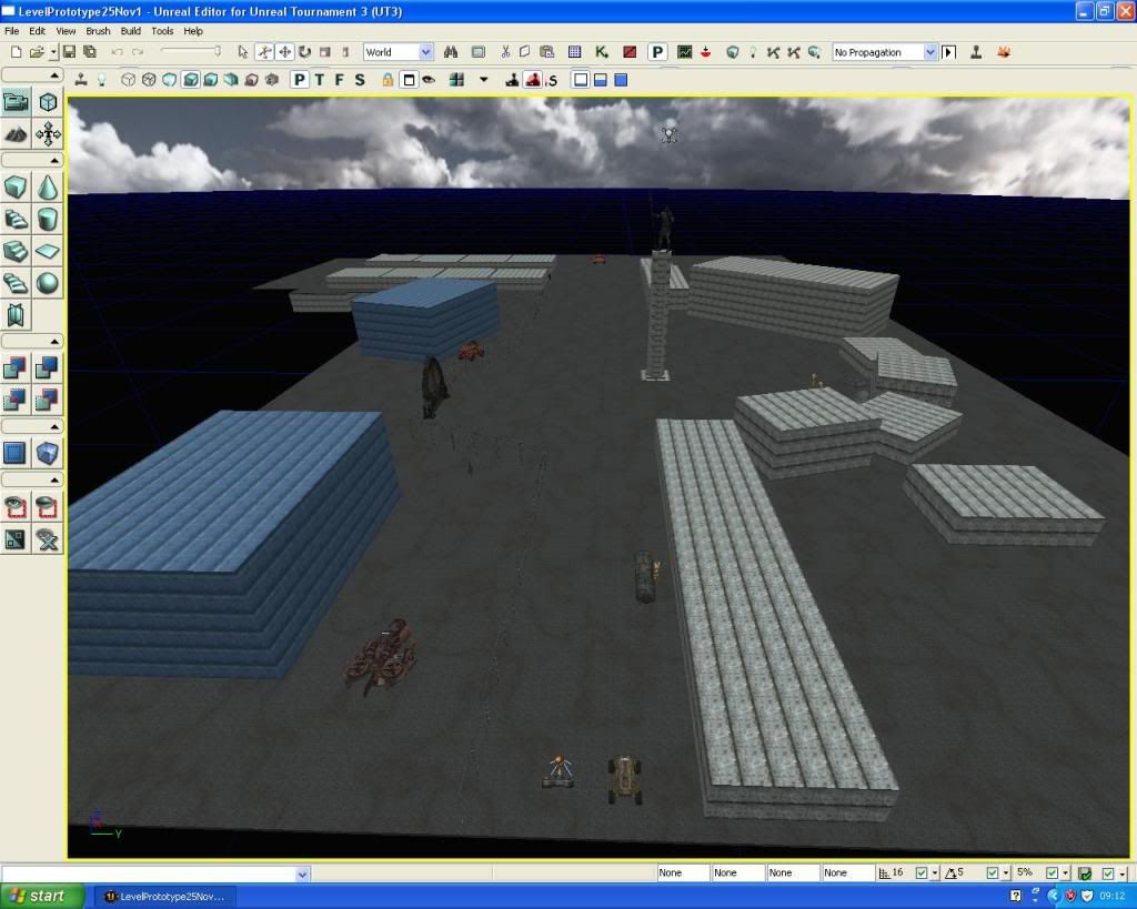

An overveiw of the level ptototype made in Unreal. At the advice of tutors i have kept the content as simple as possible; only cuboids or static meshes (pre-made models avalible in Unreal) to represent items.

The user begins in a side-street (the bottom of the screen on the picture) leading into the market area, which is the central point of the level. To the left of this is a fenced off area that will represent an upper-class estate, full of luxury and serene colours and sounds that contrast with the normal design of the market, and is designed to represent a feeling of unfairness some people may feel; why should all this luxury and happiness be restricted to a few? To the north of the market is a long street that will represent a run-down, lower class estate contrasting with the luxury estate seen earlier. The houses here will be attached rather than separate, and designed to give a feeling of claustrophobia and neglect.

The planned base series of events will be as follows. The level begins in the first instance; the “normal” world. The player moves into the market, buying an apple from a stall in the side-street on his way. In the market their eyes are drawn to a group of people to their right; one of the shops has been broken into. As he investigates, hearing the sobs and the anger of the crowd, he notices a figure looking from the corner of the northern estate. Approaching him causes the figure to run around the corner, and the player gives chase.

Walking along the poor street, listening to the noises of desolation and sadness, the player funds stairs into an underground room, in which a large congregation of people are facing an extremist character on a pedestal. This character will proceed to give a speech encouraging support for their party. Eventually the crowd begin cheering wildly and running out of the room. The player, upon following, finds the world has begun changing. The level is now in the second instance; the takeover.

A crowd of red people are running up the street, growing in size as they move. Wherever they go, the terrain behind them changes from blue to red. They stop at the end of the street, and as the player walks over, the ground begins to rumble. The giant propaganda tank rumbles into the market square, followed by the cheering crowd. It turns to the large locked gate into the rich estate and rams it open, allowing the crowd to rush in, completing the takeover of the city.

At first the takeover is positive, and the player will be thinking “is this really bad?” but then they will begin to see problems. Shops being closed down, propaganda covering the walls. People being dragged away because they are “different”. They will notice the stall from which they bought the apple will now be wrecked; the owner has been arrested.

Things continue to gown further and further downhill. The sky turns darker, lighting turns a deeper red. The background is replaced with a meek setting, large factories springing up in the distance, sprouting vast lines of tanks rumbling off into the distance. Events lead up to the player being branded “different” and so they must flee from the town. Being captured or successfully fleeing will mark the end of the piece.

*  *  *

As well as the usual meets with Dave, I had the opportunity to book meetings with two additional members of our staff; Corrado Morgana and Matt, to get their opinions of the project so far.

Showing my idea (and in a later meeting, my prototype) to Corrado, he was very interested in the idea of a piece designed to provide narrative on real life, especially related to political aspects. Discussing the mechanics, he coined the term “Tourist-like game play” to describe the observational focus, which I think sums up the project quite well. He suggested several games that I should play to help get inspiration for the tone and themes of my piece (such as “Dear Esther” and “Darfur is dying”). The former is a mod for Half Life 2 which revolves around exploring an island environment, and so would help develop the observational aspects, whereas the latter was, like mine, an edutainment game aiming to present a political message; in its case speaking out against the current Darfur conflict.

He recommended I use “nonsense” dialogue (speech that doesn’t use coherent sentences) for any dialogue in the game, to enhance the multi-cultural concept of the piece; the nonsense would mean the viewer focuses on the visuals of the game, and any audience regardless of nationality would get the same level of experience from the game. In situations where understanding what the character is saying would be important, I can make use of imagery to ‘fill the gaps’. In the speech, for example, a series of propaganda posters can be displayed behind the speaker, their imagery depicting what he would be saying.

He also introduced an interesting idea for the end of the piece; a train the player gets aboard to escape the town. The Term “underground railroad” is normally used to describe a network of sympathisers who help smuggle endangered people out of discriminatory nations (such as one that helped smuggle black slaves out of America, or Allied airman out of France if they crash landed), so representing the concept with an actual train would fit the symbolic nature of the project well.

*  *  *

Matt is a specialist in sound for games, so I focused our meeting on how sound might be applied in the piece as I guided him through the level’s prototype. For me, sound & music is one of the most important elements in creating an atmosphere for a piece, so I was glad I was able to get input from someone whose expertises focus on the field. I mentioned Corrado’s idea of using nonsense dialogue and he agreed with the concept.

A suggestion of his own he put forward was to use the political speech in the entire piece as opposed to just the speech scene itself, getting louder or softer depending on the distance the player was from the location the speech is happening. At first we considered it beginning at the start, but I suggested first triggering it when the player sees the broken into shop, so the rising volume would represent the tensions of the townspeople and rising support for the extremists.

Matt put forward the idea of using radios as a theme for the piece’s sounds and music, with elements of static and white noise shaped to create different sounds. Though this piece is designed to not have any specific time period, radio is quite common in revolution stereotypes, and played a major role in WWII both on and off the front line, as there were no TVs.

9 Dec 2009

Week 7 – Final Project Outline:

Nearing the end of week 7, I had begun to make final decisions on what I was considering the last iteration of the project idea; there were now only five weeks left of pre-production, and I focused my attentions on coming up with a solid, achievable idea for which I could prepare a formal concept brief by the beginning of the production phase in January, which should contain concept art, storyboards and game mechanics descriptions for all aspects of the project.

Looking over my two options, I have decided to proceed with the later idea; using the Morph-like human designs and bringing the project closer to the propaganda inspirations I have been following. The children’s toy concept given by my colleague was an interesting concept, and I will certainly be keeping many of the ideas from it as inspiration, but I became concerned that the toy might make the whole sight seen too ‘innocent’ and bring too much aesthetic into the project, and was leading the project away from its original concept of presenting a political message.

As I devise concepts for this project, I am going to try a new direction with the project’s mechanics. As my focus is on presenting to the viewer the warnings of political extremism, and not on making a game play experience, I am moving the project away from the mechanics of game play altogether, and considering the project more as a 3D moving art piece, with the audience more ‘viewers’ than players. I was having similar thoughts when devising my ruined city concept, and they have played minor roles in my ideas since, bringing greater and greater focus onto the viewer observing events as opposed to triggering them. Until this point, my ideas have tried to bring a game play mechanic or aesthetic in on top of this concept, with the result being concepts that drown out the message. With this final project idea, I will focus my attentions on the actual message itself, with the aesthetics minimal and designed to only present the message itself.

* * *

The environment would remain as simplistic designs and keep to the planned blue-to-red aesthetic, though as opposed to a full town as was the original plan, the piece will use only specific areas, and is designed to represent the concept of a town’s layout than truly reflect the layout. This will cut the amount of modelling needed significantly and allow the level’s layout to be focused on the elements that work toward conveying the message, helping prevent the player from becoming lost or confused while moving through the environment.

The layout will consist of a series of town areas, set around a market square at the centre of the level, which the viewer begins by walking into. As they navigate through each era, they will observe animated sequences (some triggered by their presence, others repetitive), as well as several static objects that help symbolise aspects of the message. Instead, however, of earlier ideas of small cut scenes in different areas, all of the animations will occur in the same level, with the player moving from one area to another. Though I suspect Unreal would be able to handle the entire level animating at once, due to the low-poly modelling, I plan to make use of streaming technology (separating the map into several smaller maps that transition seamlessly) to lessen the impact and hopefully maximise the smoothness of play. As these animations proceed, the world will shift between three ‘instances’; the normal world, the world when the extremists are just taking over, and finally a world fully controlled by them. The basic layout of the level will be identical in all three instances save for minor changes, with the main atmosphere change being through shifting of backgrounds, textures and lighting colours between blue and red, and the changing of some assets in game.

As opposed to specific guidance from text or narration, I want the viewer to feel that they’re exploring the environment themselves and discovering these elements on their own accord, even though in reality they are simply following a pre-set route that has been laid out before them.

* * *


'Morph' inspired design for the NPC citizens.

The character design I devised this week will serve to represent the normal citizens of the town. Instead of specific designs for each as I originally planned, all characters will use an identical model, with no race or gender or costume differentiations. I will instead show diversity by giving the NPCs different coloured textures.

My first consideration was to also have the viewer viewing the world from the perspective of one of these characters, with their hands and feet appearing on screen like in previous designs. However, looking over the concept, some colleagues suggested perhaps having the ‘player’ character invisible, and letting the viewer’s imagination fill the gap with their own body, adding a more personal dimension to the game play.

The above ideas also boost my earlier plans to try and prevent a particular culture being idolized in game. By using only colours to differentiate characters, and simplistic, representational buildings, the project will be able to appeal to audiences from a wide variety of cultures, and thus allow the project to spread its message worldwide, with the only potential changes being of specific colour choices (for example, were I presenting the product in China, I may make red the friendly colour and use another colour for the extremists, and were I in an Islamic nation, I may make the friendly colour green, which is a holy colour). I am a strong supporter of cross-cultural projects, and much of my work focuses on such themes, so I was very pleased that this project would now be following suit.

The extremist characters will likely continue to make use of the robotic design I devised for the earlier concept, as I feel this fits in well with the environment and gives a nice contrast to the curvy, organic design of the other characters.

* * *

As said earlier, the project will focus on symbols and animations that represent one of two things; the problems with ‘normal’ society that might inspire someone to support a politically extreme group (and thus problems such groups usually play on to swindle people into joining), such as economic inequality or crime, and the problems that arise when an extreme group as in power, such as discrimination and violence against those who question wrongs committed by the government.

For the economic concept, I devised the idea of having two groups of people walking around the town; one group carrying large bags of money, and another of people walking around holding empty wallets upside down and shaking them. This would serve as a passive message; not particularly dominant or drawn to by events in the piece, but noticed by the viewer as they are walking by.

For the bags themselves, I wanted an instantly recognisable way of representing money or wealth. At first I considered the dollar symbol, as this is a world-recognised currency, buy reconsidered as the dollar is traditionally considered American, and thus specific to a culture. I ten recalled how many games (namely the Civilisation series) use gold to represent universal currency. Gold was mined my many nations throughout history and was considered a valuable trading commodity, but has no specific cultural link, thus making it a good symbol for wealth to use in the game.


Concept of money bag design.

My designs for the money bag were assisted by the tutorials on Unreal engine that are being led by Richard Hurford, one of our tutors who is experienced with the engine’s operations. In it we were introduced to such features as emissive light (which allows a texture to simulate illumination and light bloom around itself) and particle spews, which create a ‘fountain’ of colour or models spawning from a point in the level. Using these features, I can have a glowing pile of gold visible within the bag, and use a particle spew to have money constantly pouring out of the bag. While an unrealistic sight (especially as the money would be disappearing in some cases as opposed to remaining on the ground) I feel it will create a good contrasting atmosphere between the rich and the poor characters; the rich have so much they do not care about the coins spewing out of their bags, yet at the same time other characters are struggling to find even one coin.


Week 7 – Reconsidering the project take two:

Over the end of Week 6 and start of week 7, I went over the advice given in the 2nd presentation. Several elements of the project needed reconsideration, including a new main character to replace the phased out girl design. I was also strongly encouraged to explore alternatives to a cartoon-based art style, which may feared would detract from the serious political message the game was trying to convey. I therefore looked back over my ideas and considered alternatives to the unlinked aspects.

* * *

A possibility put forward by a colleague was to design the assets as children’s toys, making the city out to be an imaginary world created by a child. The player would likely explore the world omni presently, observing and interacting with characters as opposed to being a character themselves. This would allow the innocence and non-understanding I had been originally seeking to remain, without the need for the young girl character I was originally using. Considering the art style I was going for of simple shapes and bright colour palette, I deemed the best approach to applying such an idea would be in the form of traditional block sets for pre-school children; which usually consisted of wood carved into geometric shapes and painted in a series of bright colours (normally red, blue, yellow and green).


Examples of modern and traditional young children's toys. Traditional wooden building blocks [right] were a focal point of my ideas in this area.

The political extremists, meanwhile, could be represented in game either in their current form as wooden puppets, or alternatively as plastic toy soldiers. My main inspiration for the latter was the soldiers seen in the movie Toy Story. As the traditional moulding method for the models left a solid plastic base on their feet, Toy Story has the soldiers semi-hopping as they walk, as if they were moving their legs and so pulling the base up and down with them. It’s an interesting, and overall, easily animated effect, and the aesthetic of toy soldiers would fit into both the new idea of children’s toys, and the older ‘brainwashed slaves to propaganda’ idea well.


Clip from "Toy Story" of the plastic toy soldiers.

An advantage to using this aesthetic is the ease of which it can be applied. Both make use of a single high-key colour over a model. The wood texture on the blocks can be applied through the addition of a bump map (a special black and white overlay which is used to simulate changes of depth on a flat surface texture).


A series of experimental wood textures made using photoshop. A wood texture from the internet was converted to black and white and then overlayed over a solid colour layer.

* * *

Another avenue I considered for restyling the project was moving deeper into the propaganda idea, and opting for a highly simplified human form, but in a different way to the 2D cartoon style I had studied before. I was suddenly reminded of the old TV Claymation show “Morph” by Tony Hart, which revolved around a character who could morph his shape, but was normally in a vague humanoid form; instantly recognisable, but lacking in many detailed features (with only a nose, mouth and ears). Looking at video and pictures of the character design, I decided to explore the possibility of using a similar character style in my project, though I would obviously vary the design in several ways so as to avoid copying Hart’s designs. Like the toy soldier idea above, these characters would be easy to model and texture, and would fit in well with the traditional environment design if I decide not to go with the wooden toy idea above.


An image of the "Morph" characters designed my Tony Hart. The body shape is incredibly simple and mostly a single colour, yet is instantly recognisable as a human form.

8 Dec 2009

Week 6 – Second Presentation & Comments:

Week 5 of the project was declared a reading week so the group could attend the “Game City” Games Design event in Nottingham, and remaining time was dedicated to reading for my 3rd year dissertation project so there was no major work on the project until we returned at the start of week 6, in which my time came for presenting a 2nd showcase of the project’s progress. Our presentations this week included an industry visitor; Australian Games Designer Christian, who was able to offer advice to groups on their project work.

As before, response to the project was mixed. There was general agreement with the general concept of the project and the overall style, many felt the project ideas being shown were still focused too heavily on being ‘realism-based’ given the representational style, and suggested consider game mechanics that would suit the style more, similar to the ideas Dave had suggested in the first week. One idea put forward was having the assets in the game made out to be children’s toys (such as toy soldiers to represent the extremists, and wooden blocks for the houses). This was in idea I liked, and shall explore further in the coming weeks.

Virtually everyone, however, felt the character design of the girl didn’t fit in very well into the project; it felt more like something put in for the sake of it than put in for a purpose. Dave, who had in a short meeting at the end of week 4 declared it the weakest part of the entire project, explained her design was going too far back into the anime idea, and suggested she be dropped. Another colleague also pointed out that Anime is known for a focus on the ‘sexualisation’ of characters (focusing on qualities that enhance the attractiveness of a character). Even the remotest possibility of my five year old character being linked to sexual connotations was the nail in the coffin for the concept, and the character was therefore officially dropped from the concept.

4 Dec 2009

Week 4 – Second Concept – Level Development:


This image is intended to be an approximation of how an in-game shot will look, were the game made based on the current concept. Though I am not yet decided on a great deal of the actual game mechanics, my hope is that presenting this at the next presentation session will help get my intended direction across to my colleagues, who will hopefully be able to offer opinions on my works and suggestions to help me decide on further developments.

As previously outlined, the game will be from a first-person perspective, with only the arms (and the legs, if looking downward) of the player character being visible. Player character emotions and actions will thus be mostly represented through sound and use of camera movement and effects (bobbing for running, blur effect for tears, etc).

The environment around the player will consist of a series of simplistic buildings and other items (bushes, fences lampposts etc), that are used to represent a stereotypical town. I will include only light texturing, as I find that in a cartoon aesthetic very spare textures (such as only putting a few brinks onto a wall, as I have done in the image), fit in better with the visuals of the world than a fully textured surface. A central aesthetic will be the transition of these elements from their starting bright colour palette (predominantly blue) to a darker one (predominantly red), which triggers in areas that the extremists have entered as they move across the town. Lighting elements will add further to this effect, starting with bright, ‘warm’ shades in areas still using the blue palette, and darker, ‘colder’ shades in areas where the red palette has activated. Both of these effects can be triggered using the trigger volumes used in my first prototype.

The base game play mechanic would be moving through the city environment, searching for a specific objective, while avoiding the Extremist characters, who would give chase if they saw you a trigger a game over upon physical contact. As the robotic characters will have slightly slowed, clunky movements, they will be easier to evade than normal enemies, which I feel is important due to the nature of the game. Were they normal speed, some players may find the game (which contains no way to defend yourself) too hard and thus not play it, while others will be sucked into the challenge and miss the setting and story. Both of these outcomes would prevent appreciation of the game’s inner message, which is the core of the project. By making the game play relatively easy, the player has the opportunity to focus on the observation of the environment and thus the message the project is trying to get across.

The book in the girl’s hand is a possible late-game feature I have been considering. Political extremism largely relies on manipulating people’s opinion by restricting what information they’re allowed access to. Thus, it is commonly believed that a key to overcoming extremism is to provide high-quality and varied education for people. My idea therefore, was that the player would eventually gain access to books, which she can throw at enemies. Being hit by the book would trigger an animation in which the extremist reads the book, and then wails with regret, either disappearing or transforming into a normal person. She could also combat the tank in this way, by throwing the book at one of the hatch openings; a pilot would then open the hatch to see what it was, grab the book, close the hatch and the tank would turn blue and stop moving.

* * *

For when the enemies and the tank were moving around the level, I feel it would be good aesthetically to have a red light following them around, to create the illusion that the colour change is being painted by their movement, rather than separate lights triggered by their presence. I created a second small prototype level to experiment with this, attempting to use Unreal’s attachment feature to attach a light to a moving block.


Though ultimately this failed, the project did show me that animations, if set to repeat, automatically jump the object back to the start of the animation. This could be applied in several situations (for example, an endless line of people or vehicles in the background).

Week 4 – Second Concept – Character Designs Pt 2:

Taking into account the findings of my research, I began the actual designs of the characters to appear within the game, starting with the players character, the girl. Though we may not necessarily see much of the character due to the 1st person perspective of the game, I feel it wise to have a definite design in place in case a situation should arise in which the player can see themselves in a mirror or a cut scene.


Opening concept sketches of main character

To create the feeling of cuteness in the character, I applied some of the ideas I had found in my research, namely the slight over sizing of the head and eyes to emphasise those areas. Giving her long hair and a summer dress both served dual purposes; both emphasised the idea of the character being female by following traditional stereotypes, but both also provided opportunities for large areas of colour. My making her dress blue, the character will fit in with the opening environment of blue buildings, yet her hair allows her to remain distinct at the same time. I have made the hair a-symmetrical (whereas other character’s will have symmetrical hair) for the same reason. A final decision was to give the character opaque tights to avoid problems with having the skirt flailing about.


Coloured concept sketch of main character

In this concept, the girl will have the teddy from the beginning, carried in one hand in most situations. Teddies have traditionally been seen as a symbol of innocence, which was my reason for its inclusion in the earlier concept, so her having it will hopefully enhance the idea of her being an innocent character. The concept of her connection to the teddy, and how it may help her persevere in the situation (by hugging it or even talking to it) is also an interesting idea, and I may include moments in the game where the teddy is used in game mechanics.

* * *

For the Extremists themselves, I originally planned to have a similar human form, but use hard angles and straight lines as opposed to soft, curved elements. I then had the idea of designing them to look like robots, with blocky bodies and clunky, mechanical movements. This would represent the idea of the extremist party brainwashing them with propaganda until they become a mindless pawn of the group.


Some of the references collected during research into media examples of human-shaped robots.

The colour schemes of characters will coincide with the ‘blue v red’ concept I devised earlier; so while the player and friendly characters (if I decide to put any in) will be mostly blue in colour scheme (their skin and hair will be normal, but clothes will be blue), the extremist characters will be completely red.


Opening Concept sketch for design of Extremist characters. All of them will use an identical model, so represent the concept of their individuality being lost when they joined the group; now they are all the same brainwashed minds.

3 Dec 2009

Week 4 – Second Concept – Character Designs Pt 1:

I had decided to maintain the concept of the young girl as the player character, so as to keep the idea of a neutral character, who would have had no control or understanding of the politics of the town, which I hope will subconsciously add to the sympathy of her position and amplify the power of the anti-extremism message the piece aims to convey.

To support these ideas, I want to emphasise the “cute” factor of the character, which I feel will amplify both the feeling of her young age, and the idea of her innocence in the situation. Thus I focused my research on studying how cuteness is traditionally approached in cartoons, focusing firstly on western cartoons and their style. My intentions from this was to pick out what elements combine to create the look of a ‘cute’ character, and hopefully work these concepts into my character’s design.


A sample of the Western-based cartoon artwork i collected for referencing.

Generally, I found that the western cartoons I studied tend to use flat colours much like the propaganda work I have been studying. In many cases, heads are slightly oversized, with a specific emphasis on the eyes and mouth, which are used to express most character emotion and are sometimes oversized. Very rarely were these characters shaded (though backgrounds were in some cases); it is likely this is a choice made to speed production of the media.

To further support this area of my research, I took the opportunity to book a meeting with Mr Don Parker, head of the university’s Advertising Design course, whose career has included major work roles with artistic departments of western comic and cartoon companies (including Marvel and Cartoon Network). The latter link was especially useful, as I had noticed striking similarities between the propaganda style I was following and that of Dexter’s Laboratory; one of Cartoon Network’s main animations. Male main characters (such as Dexter, the main character) are drawn with mostly straight lines and hard corners, much like the propaganda posters I have been studying, while female characters (such as his sister Dee Dee), are mostly made up of softer, curved shapes with almost no hard edges, much like how I am intending my main character to be.


Dexter's Laboratory's main Character Dexter [left] and his sister Dee Dee. Looking at their designs, i can see many similarities with the propaganda styles i have been studying.

However, I found myself quite surprised when Don revealed that I was in fact considering western art in completely the wrong way; Dexter’s Laboratory and similar animations of that era (such as Disney) were in fact western attempts at imitating Japanese Anime, rather than true representations of western artistic practice. For the latter, he recommended focusing my studies on western comic book companies, such as Marvel and DC, and artists such as Dave McKean, Jack Kirby and Brian bollard.


Front Covers of two DC Comics. Note the emphasis on the muscles of the two main characters (especially on the chest and stomach), and the use of jet black for contrasting block shading as opposed to the subtle shading common in anime-style works.

Don explained that the difference between western art and the anime-esque art I had studied so far laid in their inspirations and referencing. Anime-esque art tends to focus on stylised representation, sacrificing realism for aesthetics (such as naturally pink or blue haired characters), or emotional effect (characters designed to be overtly cute, etc). Traditional western cartoons, on the other hand, focus greatly on realism, especially regarding the designs of characters, where renaissance anatomical study is a major reference point. Body shape is based heavily around bone structure, with muscles and bones particularly defined through shading.

While my project’s simplified aesthetic prevent me applying this kind of aesthetic to most of my characters, it may be worth considering when designing propaganda posters to place within the level; many of the posters I have researched include realistic human caricatures, and shading to emphasise the facial features vaguely similar to DC and Marvel’s work.

* * *

While I have been avoiding Japanese art style at the recommendation of my colleagues, Japan-esque cartoons are well known for the ‘cute factor’ of characters. I therefore decided to return to my previously collected Japanese reference material briefly, analysing it in the same way I studied western cartoons; not focusing on the whole aesthetic, but the specific aspects of the art that make a character a desired aesthetic (in this case, cute).


A sample of Japanese-based cartoon artwork, collected for referencing.

From my research, I found that the methods used in Japanese art to create a cute aesthetic were much the same as the style found in my early western comic research. Characters’ heads are generally oversized slightly, especially the eyes, which are particularly large. Whether characters were or were not shaded depended on the atmosphere the artist was aiming to create, though otherwise colours on characters were usually kept quite plain. Backgrounds, on the other hand, were usually quite detailed; likely because background’s normally do not move, whereas the character will move around a great deal. Therefore, having a highly detailed character would make animation difficult, and significantly increase production times.

1 Dec 2009

Week 4 – Second Concept – Tank Design:

Continuing on with the representational theme, I was reminded of Dave’s idea of the tank with propaganda covering its hull, which really interested me when he presented it. Tanks are a common symbol of war and militaristic power, so having one as a centre point of the extremist takeover would be a sound choice. The oversized tank would seem even more imposing as the player’s POV would be the girl’s eyes and thus close to the ground, thus making the vehicle tower over her.


Artist’s drawing of the T-1500 “Ratte”, a real-life (and rather ridiculous) Nazi super-heavy tank/land fortress concept. This picture captures well the sort of towering monstrosity feel I want the player to feel when seeing the tank.

In keeping with the style of the project, I wanted the tank to be a very stylised tank, not one necessarily based on real life concepts. I therefore see three possibilities for the design; making it a very curvy, ‘cartoon-ish’ vehicle, using a more blocky design, or using a vehicle from real life.


Examples of images collected for mood boarding the tank were I to go for option 1. These are some of the soviet vehicles from the RTS game “Command and Conquer: Red Alert 3. While the vehicles are interesting design-wide, I personally feel the curviness doesn’t really suit a heavy assault vehicle.

All three options would fit into the project well, though I think option two would be the better option, as it would be both an original design and suit the Dimitri Moor inspiration.

* * *

Ironically, I may make use of an existing vehicle after all; the Ratte image I collected reminded me immediately of another WWII German vehicle; the Maus, one of which was actually built. It is a very blocky design with rather flat sides, which would make it perfect for displaying propaganda posters. I may decide later to create a more original tank design, but for now, I may make use of the Maus as a placeholder thank.

 
Diagrams for the Maus Tank, and picture of the single existing prototype in Kubinka Tank Museum, Russia.

Week 4 – Second Concept – Outline:

Having had the chance to look over the information gleamed from my research, combined with commentary from my colleagues and workmates, I began to rebuild the project’s design to take into account the new choice of art direction (propaganda posters), and reconsidered game mechanics.

As I was now going with a highly simplified art style, I decided to move away from the concept of a ruined village, and, as Dave had suggested, instead approach the town settling as a more representational environment than a true-to-life settlement. The child (unharmed this time) would remain the player character, navigating through a town environment. Perhaps the whole project would be the imagination of the child? Perhaps her nightmares? Did the project even need any logical explanation? My tendency to keep to semi-realistic boundaries in designs can at times restrict my work, so I think following a more representational aesthetic such as this would be a good development experience for me.

 The basic game mechanic is similar in some ways to my early Raijin concept; it will revolve around the player running through the environment as the child, avoiding the Extremist enemies that confront her. Originally the town would begin empty of them, but they would then begin to appear steadily, slowly taking over the town. To represent this taking over of the town, I would make use of brightly coloured lighting that would switch from blue (representing parts of the town not controlled by the extremists) to deep red (representing parts that are). The town would thus begin completely blue, but turn red piece by piece as the extremists arrived and began moving around. I was already sure of how I would go about doing this in Unreal, and so created a simple proof-of-concept map to showcase the effect.


Shots from the lighting showcase map. The block that represent the buildings each had a blue point light, which would turn red (like the light in the bottom left corner) if the player approached them on foot or in a vehicle.

One the advice of my colleagues during the presentation in week 2, I will be keeping away from an anime art style focus (though I may still refer to aspects of the style, as I will describe later), and instead adopt an approach more akin to Dimitri Moor’s works, with mostly flat colour and simplified details on objects, which is easily achievable by a team of one. His ideas of hard angles and straight lines would also be applied to buildings, and possibly the political extremist characters themselves. For normal citizens however (should any appear), I will be keeping to a soft-angled cartoony style, to help stand them out from the extremist characters.

In addition to my propaganda research, I decided to look deeper into cartoons and other simplified representations of worlds, to explore how such media successfully conveys its message despite using what are quite minimal assets.

 
A shot from the game “Noby-Noby” boy by Keita Takahashi, for the PS3. Takahashi-San’s game is a perfect example of the kind of aesthetics this project is considering; it uses extremely stylised assets and game play is generally quite unrealistic, but the two create a highly entertaining and colourful atmosphere for game play. One factor of this could be the concept of ‘finish’ I was introducing in the 1st Week; all the assets have been given the same treatment, thus keeping a sense of uniformity and completeness across the work.

Week 3 – Researching Soviet Propaganda Posters:

By week 3 of the project (a quarter of the way through the pre-production segment), I was beginning to get a little worried about the project. I was clear that no one would be joining the group, and my project might not be achievable by one person in the allotted production timeframe of twelve weeks. Fortunately, our tutors offer tutorial slots outside of lessons for one-to-one discussions of our work, so I took what I had so far to Dave Surman for his opinions and hopefully some ideas on where to take the project.

Overall, he was pleased with the project’s edutainment objective, but strongly recommended I reconsider my stylistic approach, fearing again that the detailed environment would detract from the political message within. As he explained, I had convinced myself that the only options art-style wise were either anime or realism, which was simply not the case, and the project had great scope for a really interesting stylistic approach even with the restriction of it being a lone project.

He took notice of the propaganda poster idea that was to be one of the smaller segments, and he put forward the suggestion of reapplying a propaganda art style to the project as a whole; in most cases stylised with very simple shapes (much like Lucky star, which I referenced in an earlier post) and commonly using symbolic rather than realistic objects (such as a monster to represent an evil human). The level therefore did not need to necessarily resemble a true world; buildings could merely be blocks, or even floating platforms linked by ramps. A tank could be oversized to gigantic proportions to make it more imposing, and covered in propaganda artwork, becoming more of a gesture of political extremist will than a vehicle. Helicopters could be shrunk to the size of bees and buzz around the player annoyingly.

We both felt these would suit a one-person project well, and he explained that it would further focus attention onto the message. He recommended the Soviet Union, which was well known for its powerful propaganda machine, to be a good starting point for my research.


A Quick pen sketch by Dave to demonstrate how human form is presented stoically in traditional Soviet-esque propaganda pieces, with sharp angles, straight lines and strong contrasts of light and dark (which was an aspect of art I had previously expressed interest in).

Happy with the ideas put forward, I have finally decided that I will go ahead with the project alone; the new style devised by Dave and myself is far more achievable by one person, and no other members of the year are available to join up by this time anyway; all are in groups, and those groups are well into development and have no real space for new members.

* * *

Using the University Library and the Internet, I was able to piece together a timeline of important events in the history of Soviet propaganda, and gather several examples of artists and their works.

Propaganda was a centre point in Soviet politics from the very beginning; 1917 when Russian Communism first began its uprising against Imperial rule. It was considered a vital method of reaching the soviet people; it was easily understood, memorable, quickly made and replicated, and did not require much knowledge of literacy (which some communities in Russia at the time lacked). The founding fathers were three men. The first, Alexander Apsit, an icon painter and allegorical artist, began work in 1918 and is most famous for having designed the ‘hammer and sickle’ and ‘red star’ icons used to represent the Soviet Union, and now widely applied in communisms worldwide.


Apsit's Hammer and Sickle and Red Star icons; used as insignia's of the Soviet Union (the Goverment and the army, respectively), and commonly found in many communist nations.

The second and third, respectively, were Dimitri Moor and Victor Deni, who both started in 1919. Moor was trained as a satirical artist, and, despite his atheism, was highly interested in the iconography of religious artwork (looking more at the form, colour and emotions of the art itself than off the ideology it represented). His propaganda work set the standards for works that followed, focusing on strong, contrasting colours (most commonly red, black and white). Victor Deni’s specialty was in the field of caricature, drawing depictions of existing or fictional figures that conveyed particular opinions (such as the obese, top-hatted cartoon character below, used by Deni to symbolise capitalism, which was considered the enemy in Communist ideology).


Examples of Dimitri Moor's work. Note the simplicity of the colour scheme and blocky shapes.


Examples of Victor Deni's work, depicting the "obsese capitalist" icon he designed.

In most art pieces, communist citizens (usually represented by a blacksmith or labourer) were commonly given strong, stoic poses, designed to create the look almost of a stone statue. Depicted opponents, on the other hand, were usually depicted in grotesque or even inhuman forms, so as to alienate Soviet citizens from the concept of them as fellow human beings; they were monsters seeking to crush the Union.

Soviet postet use was taken further during the 20s by the concept of ROSTA posters, created by a team led by poet Vladimir Mayakovsky and artist Mikhail Cheremnych. These were designed to be posted on shop windows, and aimed to educate Soviet people on general knowledge deemed beneficial, such as tips for healthy living. Though more colourful than Moor’s designs, ROSTA maintained the practice of simple, generally blocky shapes.


Example of a ROSTA poster, by Mayakovsky and Cheremnych.

The same was true in El Lissitsky and Alexander Rodchenko’s work in the Post-World War 1 period, around the time photography came to prominence (and was experimented with widely by the two). World War II and the Cold-War era saw a fusion of such abstract concepts with the flat black, red and whites of Moor’s work, with a focus on the concept of “Social Realism” enforced by Stalin's regime; the use of art only as a means to convey data, as opposed to art for art’s sake.


[Left] A peice of experimental artwork by Rodchenko. [Right] One of Lissitsky's most famous (and in fact his last) posters, inspiring the Soviet population to build more equipment for the army during WWII.

From this research, I took note of the aspects that were common throughout. Shapes were kept simple and usually flat coloured, with minimal block shading of a contrasting colour. Caricatures of Soviet people were usually in strong, stoic poses, and drawn with blocky, straight lines, while their enemies are usually depicted in grotesque or monstrous forms, designed to amplify their negative aspects and reinforce feelings of them being inhuman.

With these notes, as well as minor research into other examples of propaganda work (such as WWII propaganda posters from America, Britain and Germany, and modern Vietnam and Chinese posters), I was then able to look back over my project and see how it could be redesigned to make use of these concepts.

30 Nov 2009

Week 2 – Reconsidering the Project Pt2:


As I developed the new concept further, I decided upon the design of the child the soldier would encounter at the end; a five/six year old girl:


Injured child concept. The teddy bear in her arm in this scene is the teddy that is dropped on the ground. My thought was as the soldier carried the girl past it, they or another soldier would pick the teddy up and hand it back to her.

My main reason for using such a young character was to capture the idea of innocence and naivety. With an adult character, the audience may have not have necessarily had sympathy for their plight, as it was the citizens who supported the extremists’ rise to power in the first place. A child of that age, however, would be oblivious to such concepts, and would have had no say in who was in power, thus an audience would immediately sympathise with her. This will help drive home the message of the piece.

* * *

While discussing the project with a colleague, Andrew, I find myself reconsidering the player perspective of the piece, having the child the player character as opposed to the soldier. Having the child as the focus would not only be more interesting, but allow the project greater scope for emotions in the design, as the child, not understanding everything that is happening, will likely ‘imagine’ much more of the environment than an adult, who would see the world for what it is. So for example, a tank rumbling by to an adult would be just a tank, but a child might see it as a large fanged mouth, thrashing like a monster. Changing to the child also allows the reinforcement of the sympathy for her (by viewing all of the events from her perspective), and the friendly image of the soldiers, whom she would initially only hear and think evil, until encountering them at the end and realising are not so, especially when one cradles her and carries her outside; seeing this from the child’s perspective, I feel, will be an interesting sequence, and one I haven’t seen in many (if any) games in the past.

The change of character, of course, necessitated a redesign of the level, with the player starting in a ruined basement, and discovering the items originally dotted around the street as they make their way through the room (with the exception of the teddy, which the player will see being dropped in a cut scene, but wont be given back till the end).


Concept for new main hub area; the ruined building that the girl has run into. It is strewn with rubble and wreckage, a particularly large pile forcing the player to navigate around the circumference of the room in order to reach the door.

The triggered events would be from her perspective, and will provide some interesting points of view for the audience; in the speech clip, for example, the viewpoint will begin with the girl unable to see anything with the adults crowded around here, then she will be picked up by someone and moved to where she will be able to see. The fact the girl is injured will also allow me to return to the mirror’s edge-esque camera considerations I was looking at with the original Raijin concept (see first post); a limp can be created by having the camera jerk in one direction and then lazily move back up as she walked, and tears can be simulated using whimpers and light blurring effects on the screen.

Unlike the previous idea, here the soldiers interact with the child from the outset; it is their yelling and the rumble of vehicles that wakes her up, and inspires the player to move (whether to investigate the noises or to run from them). She may see only vague silhouettes or parts of them for the first half of the game, to help the player feel the tension the girl would feel, thinking they are looking to kill or hurt her. One of them eventually hears or sees her and starts calling out, and the tone and words of his voice begins to reveal their true nature, inspiring the player to crawl through a gap in the rubble, where she finally meets the soldiers face-to-face, who then carry her to a truck, which drives away down a street, ending the game with a gentle fade out.

The designs of the soldiers themselves I will look to next week. I am looking to maintain a multi-cultural atmosphere to this project, so I will likely design the soldiers to appear to herald from a variety of races, to prevent any particular culture being portrayed as the good guys. The extremists too will lack any particular cultural focus, merely be a amalgamation of stereotypes studied in research into such groups.

Week 2 – Reconsidering the Project Pt1:

Based on the comments received during my first presentation, it was evident that the project needed serious redevelopment, and was likely not even achievable for a single person to complete alone. I therefore focused my attentions for the weeks remainder (Wednesday till Saturday) on looking back on the project and deciding ways I could take it in a new direction, whilst at the same time making the project more feasible for one person to complete. At the same time I am continuing to enquire with other groups as to whether they require new members, though it appears that few if any, have such a need.

I have made the decision to follow my tutor’s advice and abandon the “Raijin” storyline that I originally planned to use. With hindsight, I realise that I have been trying to force the game concept to fit around my original storyline idea, instead of the other way round. This was a mistake, and was dragging my project away from its original concept of focusing on the political message, as Dave was explaining. Therefore, I have focused most of this week on developing an alternative concept for the game, specifically one that focuses less on a deep story, abandons the anime art style, and focuses more on the actual anti-extremism message I wish to portray with the game.

* * *

The alternative idea I decided to explore is that of a town ravaged in a recent conflict. The political extremists, in this case would have left the area prior to the game’s beginning, leaving only remnants of their presence within the ruins, and the town was now being liberated by another, non-extreme military force, whom the player was a soldier in. Whereas the Raijin concept was a highly interactive stealth game, I am considering for this concept a more observational mechanic, revolving more around the player witnessing events than on deeply interacting with the world. Items scattered around the ruined city ‘hub’ environment would trigger small segments of game play, laid out as if they were the player character’s memories or imagination deciphering earlier events (the rise of the nationalists, their taking of the town, the horrors by them) making this more of a 3D explorative environment than a fully-fledged game, which I feel would better suit the objective of broadcasting the socio-political message.


When developing this concept, I also considered using background music, feeling that music is a vital component in establishing atmosphere in an environment. Searching for a sombre piece, I was reminded of the popular song, Agnus Dei by Samuel Barber, which was notably used in the Computer game “Homeworld”. I feel the music achieves the feeling I want well, and so may make use of it in this project as my BGM.

Artistically I will keep to the concept of simple models, but instead of a stark, stylised approach as found in anime, I would look to a more realistic texture treatment, using features such as bump mapping to enhance the look of objects. My main inspirations for the environment and atmosphere in this case are war movies such as Band of Brothers or Enemy at the Gates, notably those scenes set within city environments.


Concept sketch of the layout for the level, focused around a devastated street intersection and two parked military vehicles. As with the earlier Raijin project, I wished to try and contain the level as best as possible; focusing on a smaller, carefully designed and filled space as opposed to a large open level, hence the street setting, with the routes out blocked by rubble, vehicles, or soldiers warning of dangers in that direction. This will be highly beneficial for me if i decide to carry on working on the project alone.

The overall level would use muted, low-key colours, with one colour in particular dominating (a mustard yellow is the current one I have in mind). This is to contrast with several items that would be placed around the environment (as shown in the picture). The street would therefore become a hub-world, with each of these items triggering a small piece of game play or cut scene in another environment. Each event follows a different aspect of the extremist activity about the town, with the item serving as trigger chosen to symbolise that particular aspect.

Start: The player begins inside a friendly APC, the interior of which is pitch black. The rear ramp then slowly lowers and allows them exit. I felt this would be a powerful image to begin the game with; the music triggering in the pitch black, then the ramp opening to show the devastated world outside the vehicle.

Money Bag: found on the second floor of a building, clasped by a dead arm reaching out of a pile of rubble; a person who had been desperate to keep the money. It represents the desire for wealth or power, or fear of loosing them; issues that are commonly a base motivation behind supporting a politically extreme group, who usually draw their support from poorer parts of the population. Approaching the bag would trigger a scene where the player is in an estate, observing the impoverished citizens of the pre-ruined town.

Poster: Found on a wall, this is a propaganda poster left behind from when the extremist party ruled over the town. It will trigger a scene where the player is amongst citizens at an extremist rally, listening to a speech by a man on a pedestal. Over time, more and more of the group begins to cheer and punch the sky, with the player perhaps being given the option to do the same.

Derelict Tank: The burnt hulk of an enemy tank. It triggers a scene of the extremists building up arms, and/or of a battlefield in which they are invading another nation, showing the horror of their lust for conquest.

Teddy Bear: A Child’s teddy bear discarded on the floor. It will trigger a scene of the town being attacked, but set within the same space, with civilians fleeing for cover, abandoned by the extreme government they thought would protect them. In the scene she drops the bear in a crush of people, and flees into a large building in the corner of the environment.

Injured Child: This would be the child the player had watched drop the bear in the previous sequence, having survived the fighting by hiding in a basement of the building. It is set in the actual city environment instead of shifting to a different period of time. She is badly injured, so the player carries her out of the building, which serves as the last sequence of the game. I feel this a good symbol of a new hope for the town now it had been liberated, with this new faction (the soldier’s) here to now help the town rebuild.

With the soldier helping the child, I also like presenting a scenario in which a soldier is providing aid and showing sympathy; I sometimes feel that games centred on soldiery focus too heavily on mindless combat and savagery, showing no other aspects of a soldier’s life, which during deployments commonly involves humanitarian work. By having the player soldier not fight at any point in the level, the warrior image is lessened and his human side is brought more to the fore, reinforcing the idea of the liberating soldiers being not invaders, but a ray of hope for the town.